Informative and beautiful maps have the power to tell stories and mediate local insights to a wider public. Urban planners use these intuitive spatial visualizations to communicate with residents about the ongoing development projects. Learn how to make an interactive map with Carto that visualizes the results in a few clicks using your geospatial data.
Carto Builder for Visualizing Geospatial Data
Carto’s software product, Builder, is an intuitive online drag-and-drop tool for discovering key insights from location data. Builder allows easy importing, filtering, analyzing and visualizing with complex virtual data sets. The software supports all common GIS file formats and offers a built-in analysis tool for exploring data patterns to, for example, predict, determine or optimize locations.
To put it more concretely, urban planners could apply this to estimate the best locations for city bike stations. Or they could use it to find clusters of areas that are lacking daily services such as grocery stores.
The final map product can be published online for everyone to view. Or, optionally, its visibility can be restricted with a password. The map visualization can also be integrated to one’s own web page by using an iframe code.
The Benefits of Creating Interactive Maps
The true strength of Carto’s Builder lies in its interactivity. Thanks to the software’s widget tool, analyzed data can be examined in real time according to the readers’ interests. In the published map, each widget interacts with a numeric data set, to which the map visualization responds without making changes to the original data set. In other words, widgets help the reader to visually navigate (that is — filter) a data set in a specific geographical context.
Since Carto functions completely on the web, there is no need to install any software and the service is available to the user and the public everywhere and always. In this way, Carto opens the door to new customized mapping experiences that can unite the interests of many and enhance the quality of visual analysis to better understand the location data at hand.
Make Visualizations Into A Transparent Story
The role that visualizations play in mediating the messages behind spatial data is crucial. This is something we must pay special attention to both as map makers and as map readers. Creating a visual map always involves subjective decisions of the cartographer, such as choosing analysis and classification methods or just the colors displayed. How a map is presented indeed plays a vital role in what is presented.
However, together with powerful analysis tools such as Carto, we can increase transparency by empowering the map users themselves to interpret the results. We believe that making location data manageable and meaningful for everyone can contribute to better participation and involvement in urban planning.
“To accomplish great things we must first dream, then visualize, then plan… believe… act!”
– Alfred A. Montapert
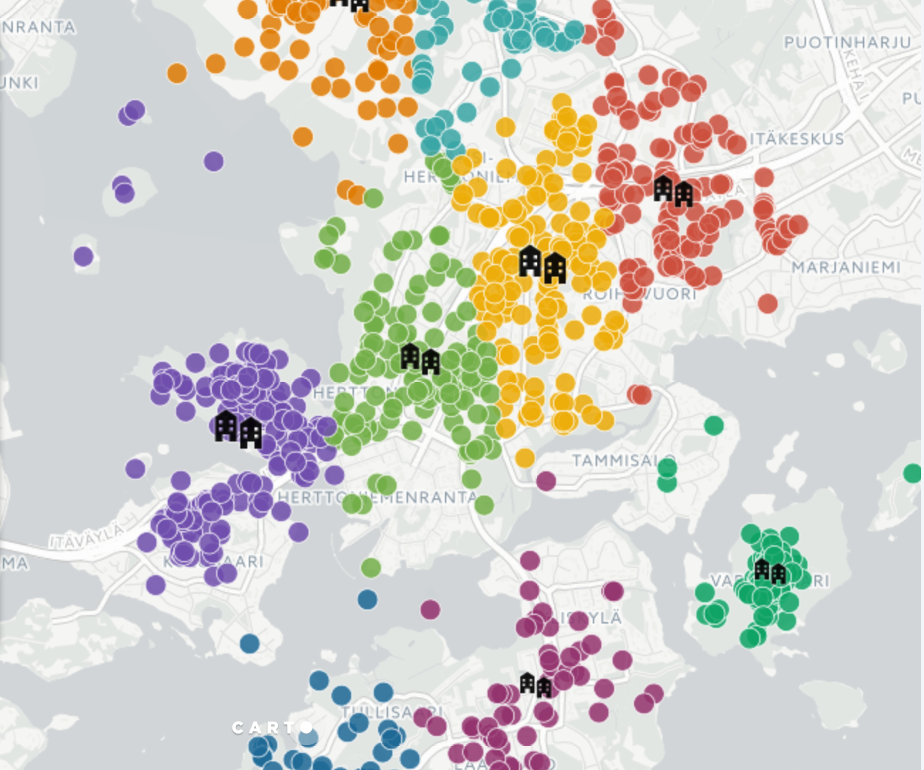
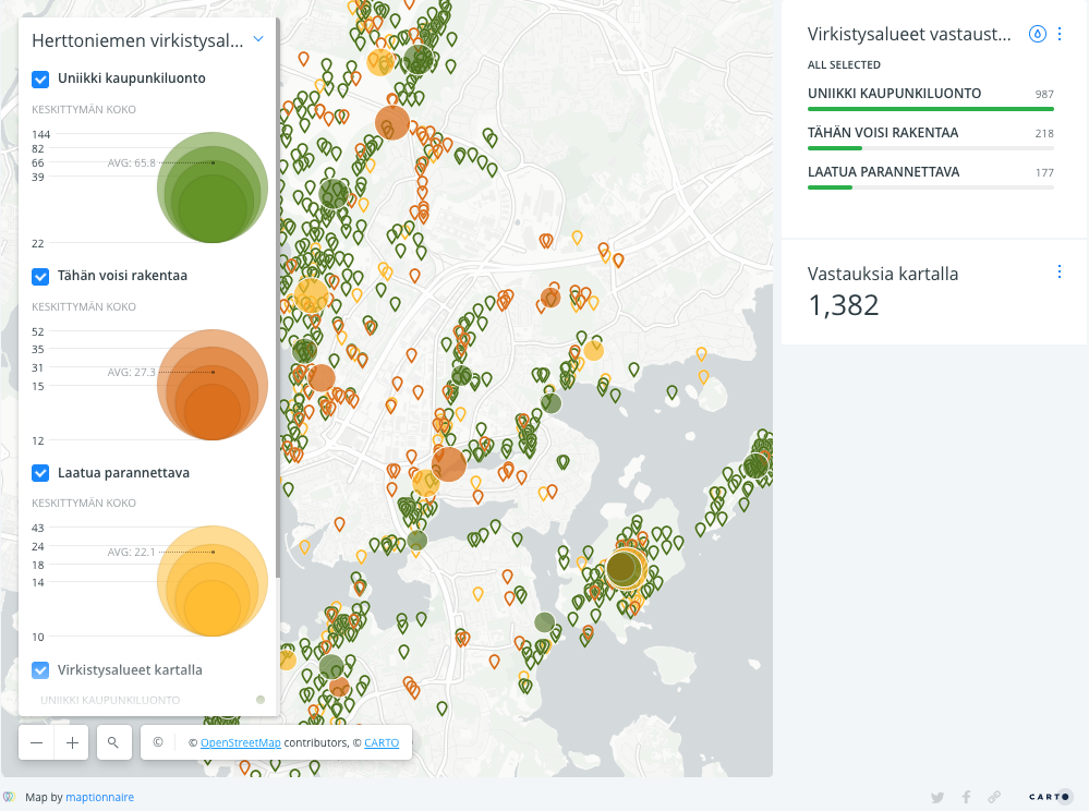
Geospatial Data and Smart Urban Planning
The example above uses a dataset gathered from residents with a Citizen Engagement Platform Maptionnaire. With this platform, residents can engage in planning processes by leaving their constructive feedback to online questionnaires. Maptionnaire itself has powerful interactive mapping features which enable you to guide respondents spatially and gather their ideas right on a map.
This information gathered with Maptionnaire is available as geospatial data and can then be analyzed and visualized using Maptionnaire’s own built-in data analysis tool. The visual outcomes, i.e. maps, strive to pinpoint key findings and highlight the importance of local-level knowledge to change the way better living environments are planned for all of us.


Want a real use-case? Have a look at how PPGIS visualizations helped Gothenburg to preserve its artistic and cultural scene.
In smart urban planning, it is increasingly important to find ways to turn location data into creative outcomes. That’s why we suggest adopting Carto, a location intelligence software, to further enhance our possibilities of interpreting, visualizing and sharing spatial data gathered from the public, and the advantages it has for participatory urban planning.


.webp)

.jpeg)
-min.jpeg)
.jpg)


.jpeg)


.jpeg)


.jpeg)


.jpeg)
.jpeg)
.jpeg)


.jpeg)